
GM, COT❣️ Yuzunoko here.
When photographing a white costume, do you look at the color tones as well as the brightness?
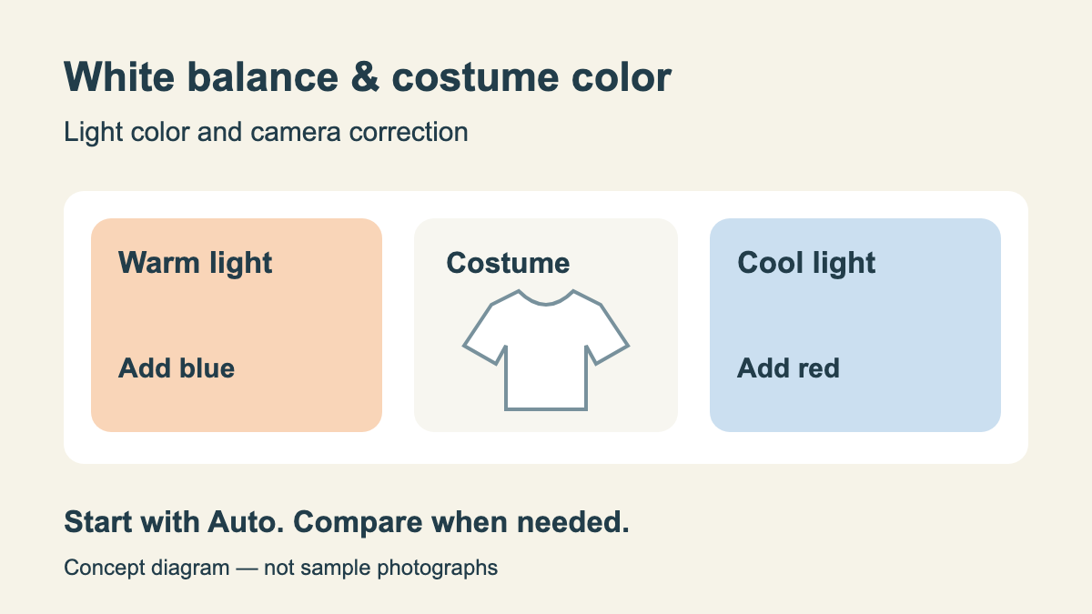
Sometimes white in a photo looks bluish, or indoors it leans toward orange. When thinking about costume colors, white balance is what you want to know about.
In Nikon's official lesson, it is explained as a function that compensates for the tint of light at the time of shooting and captures images according to your vision. Beyond simply bringing colors closer to what the eye sees, it can also be used to create warm or cool atmospheres.
The Light Illuminating the Subject Also Affects Costume Color
According to Nikon's lesson, light affects the color of objects, and the camera captures the influence of that light as well. That is why the impression seen with your eyes can sometimes differ from the color tones in a photograph.
Even on the same sunny day, the color of light changes between direct sunlight and shade. Being sunny today does not necessarily mean the exact same setting will work all day.
When you are concerned about how white your costume looks, first check the color tones of the overall photo. This is so you can separate whether you want to adjust brightness, or whether you want to adjust blueness or redness.
(Even though we simply say "white costume," there are many things to consider in a photo.)
The Color of Light and the Color Compensated by the Camera Work in Opposite Directions
Color temperature expresses the tint of light numerically, with units in K (kelvin). According to Nikon's explanation, the lower the color temperature of a light source, the stronger the reddish tint; the higher it is, the stronger the bluish tint.
White balance, on the other hand, compensates for color in a direction that cancels out the influence of that light. In the lesson's examples, the "Incandescent" setting, corresponding to reddish incandescent bulb light around 3000 K, is an adjustment that adds blue. The "Cloudy" setting, corresponding to bluish overcast light around 6000 K, adds red.
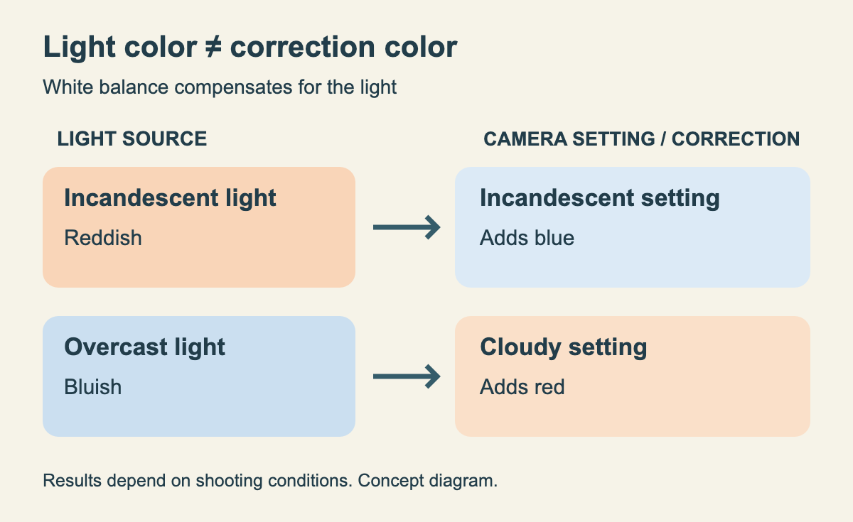
The name "Incandescent" does not mean turning the photo into an orange hue like an incandescent bulb. It indicates which type of light the setting is designed to match.
(If you think the name of the setting and the color added to the photo are the same thing, it can get confusing.)
Start with Auto, Then Switch to Light-Source Settings When Needed
Nikon's lesson recommends keeping the setting on "Auto" as a general rule, and switching when colors do not turn out as desired or when you want to change color tones intentionally. Auto accommodates many light sources.
Settings tailored to light sources include "Direct sunlight," "Cloudy," "Shade," "Incandescent," "Fluorescent," and others. However, available types and operations differ by camera model. Please check your camera's manual.
As a method for matching colors more accurately, the lesson also introduces "Preset manual." This is a function that matches based on a subject or light source, or applies the same white balance as an image on a memory card. There is also a "Color temperature" setting where you specify the K value directly.
Rather than deciding on a numerical value right away, start by looking at the color taken on Auto and comparing it with a setting that matches the light source. This article suggests trying them in that order.
Matching Costume Color, or Creating Scene Mood
The desired finish differs between scenes where you want to preserve costume colors close to how they appear to the eye, and scenes where you want to enhance the warmth of dusk or the cold mood of the night.
Nikon's lesson showcases sample photos using "Cloudy," which adds red, to create a warm atmosphere, and "Incandescent," which adds blue, to create a cool atmosphere. How any setting renders an image will vary depending on shooting conditions.
Whether you showcase a cute costume in a soft atmosphere or a cool costume with cold color tones, color differences can also become part of the fun of photography❣️
First decide whether you want to match the costume's colors or create a mood, and then try comparing settings.
About This Article
Translated from the Japanese original.
This article was compiled based on Nikon's white balance lesson and the D850 online manual. Setting names, operations, and available features vary by camera. It does not guarantee that costume colors can always be reproduced with specific settings.
If you also want to learn about the direction of light, as well as using shade and backlighting, visit Light for outdoor cosplay photos: angled morning and evening light, midday top light, shade and backlight, and what a reflector does, sorted out with camera makers' official guides.
See you next time on COT❣️
Sources: Lesson 3: Mastering White Balance (Nikon) (Japanese), D850 Online Manual: Changing White Balance (Nikon) (Japanese)